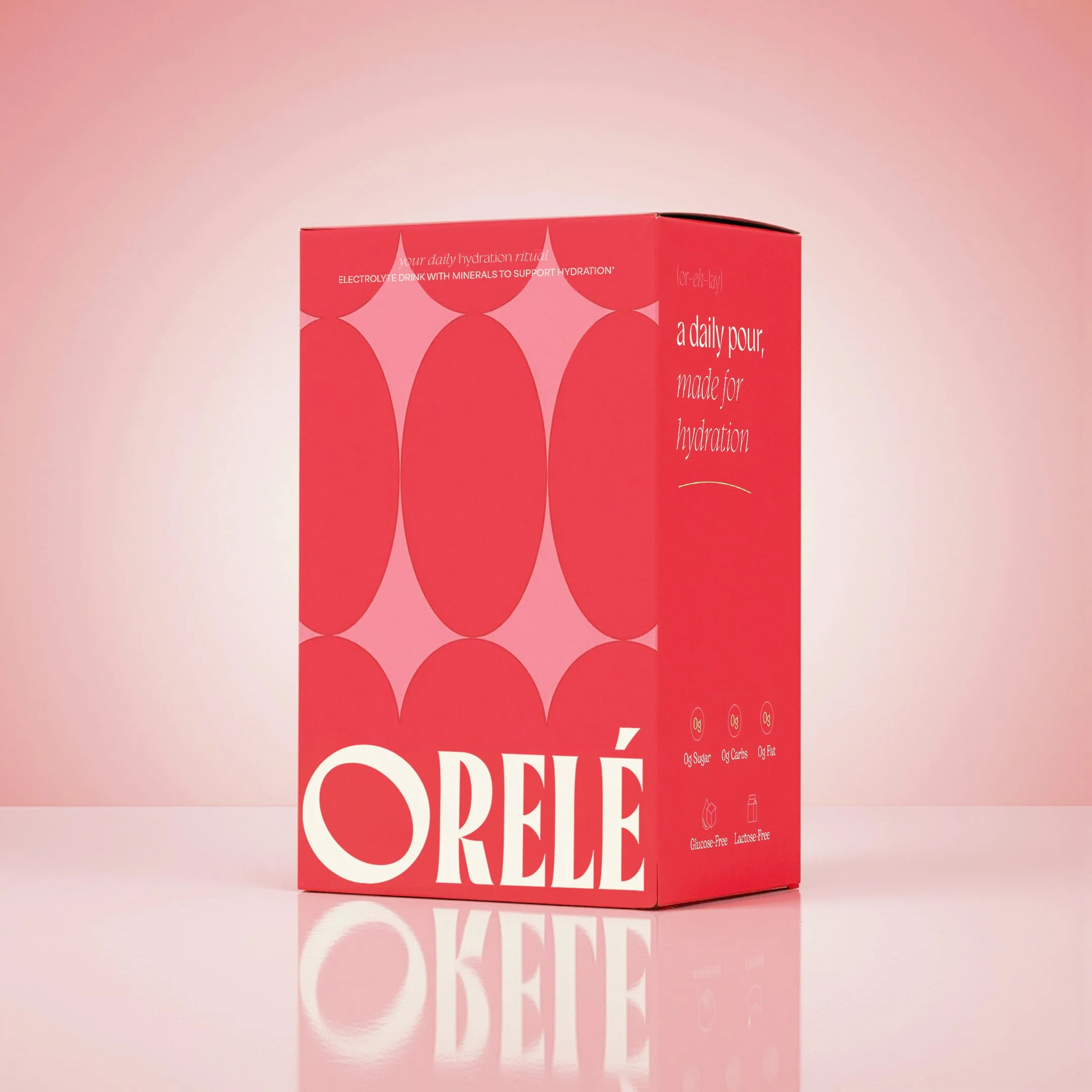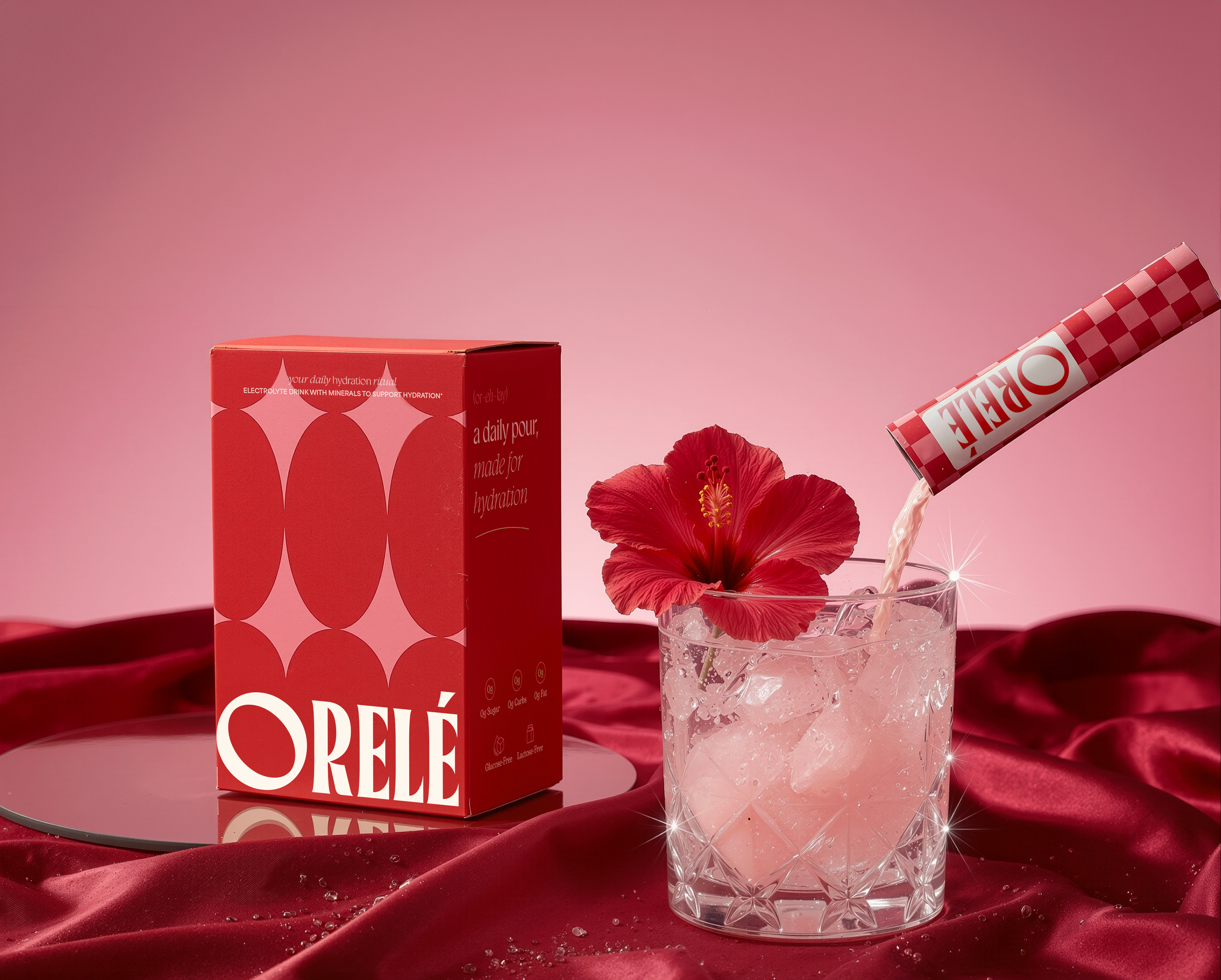
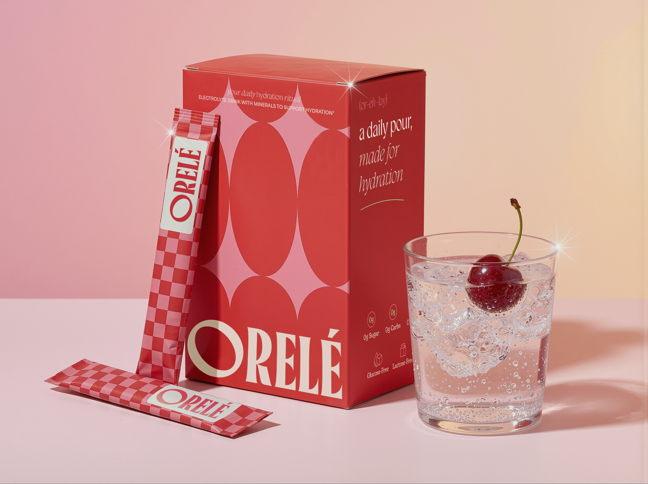
Orele is a hydration ritual designed to turn a simple habit into a luxurious little moment in your day. Built around the idea of “a daily pour made for hydration,” the brand approaches functional wellness with a softer, more indulgent perspective. We created a refined visual identity and packaging system that frames hydration as something elevated, intentional and worth looking forward to.
BRANDING
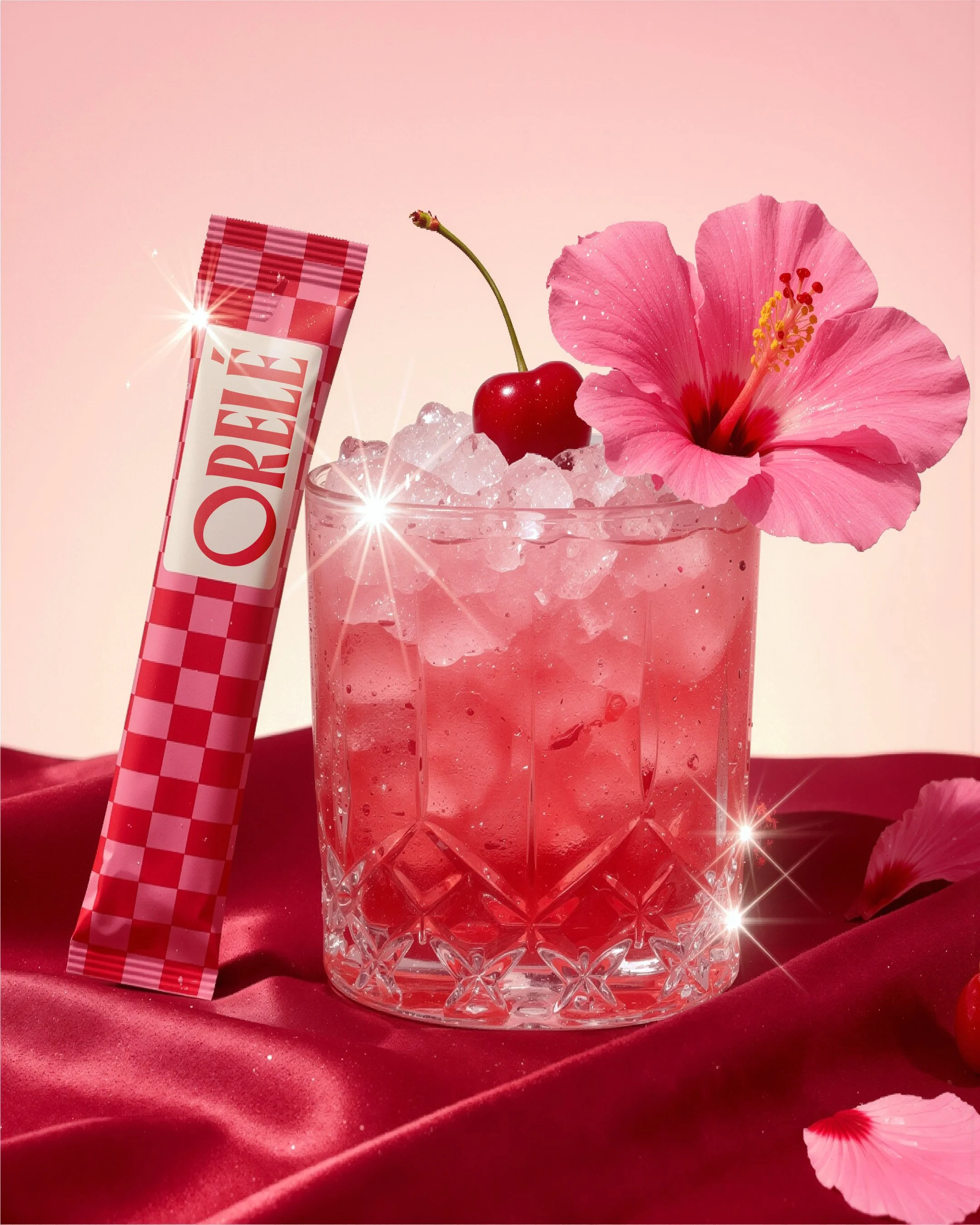
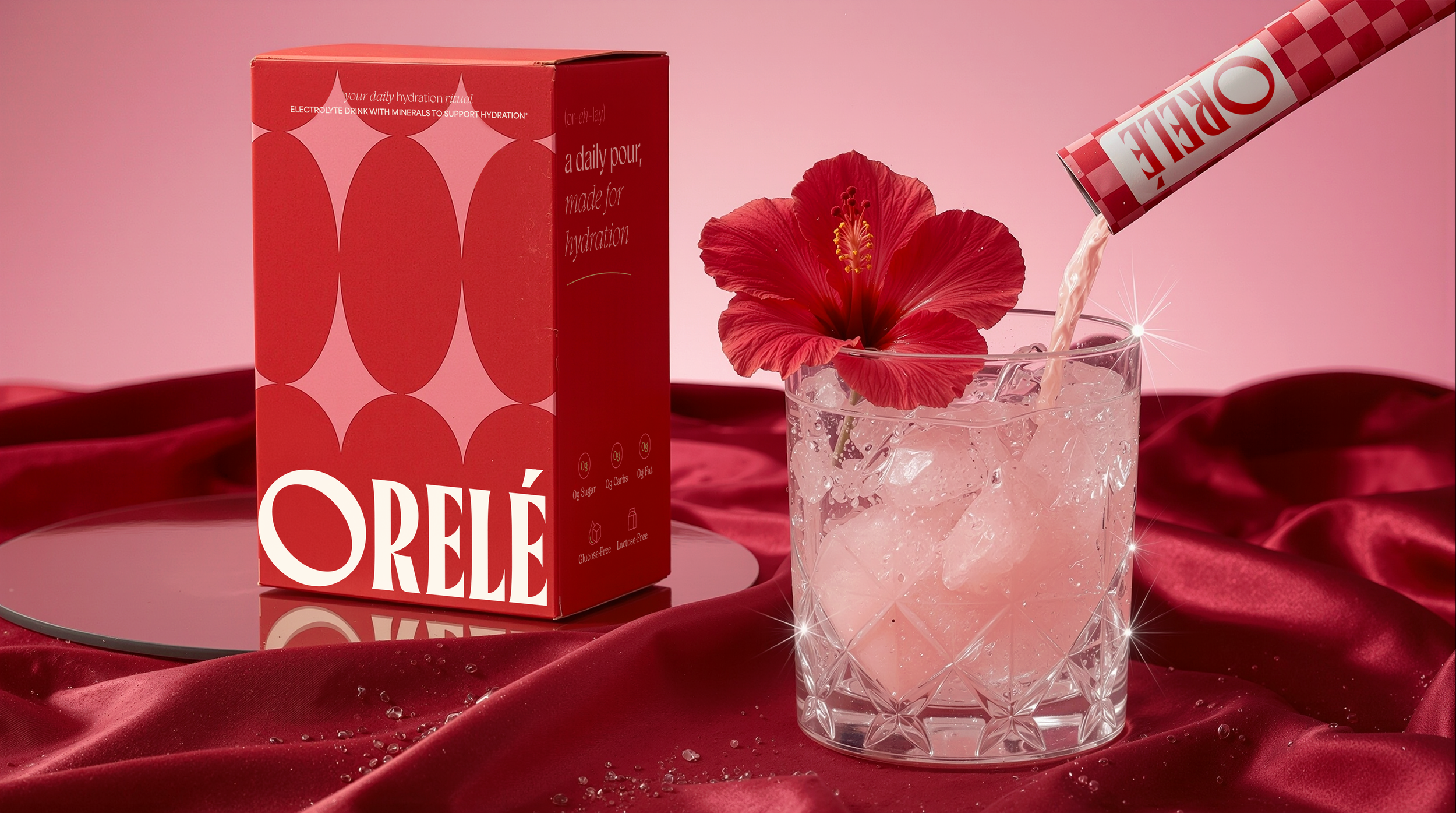
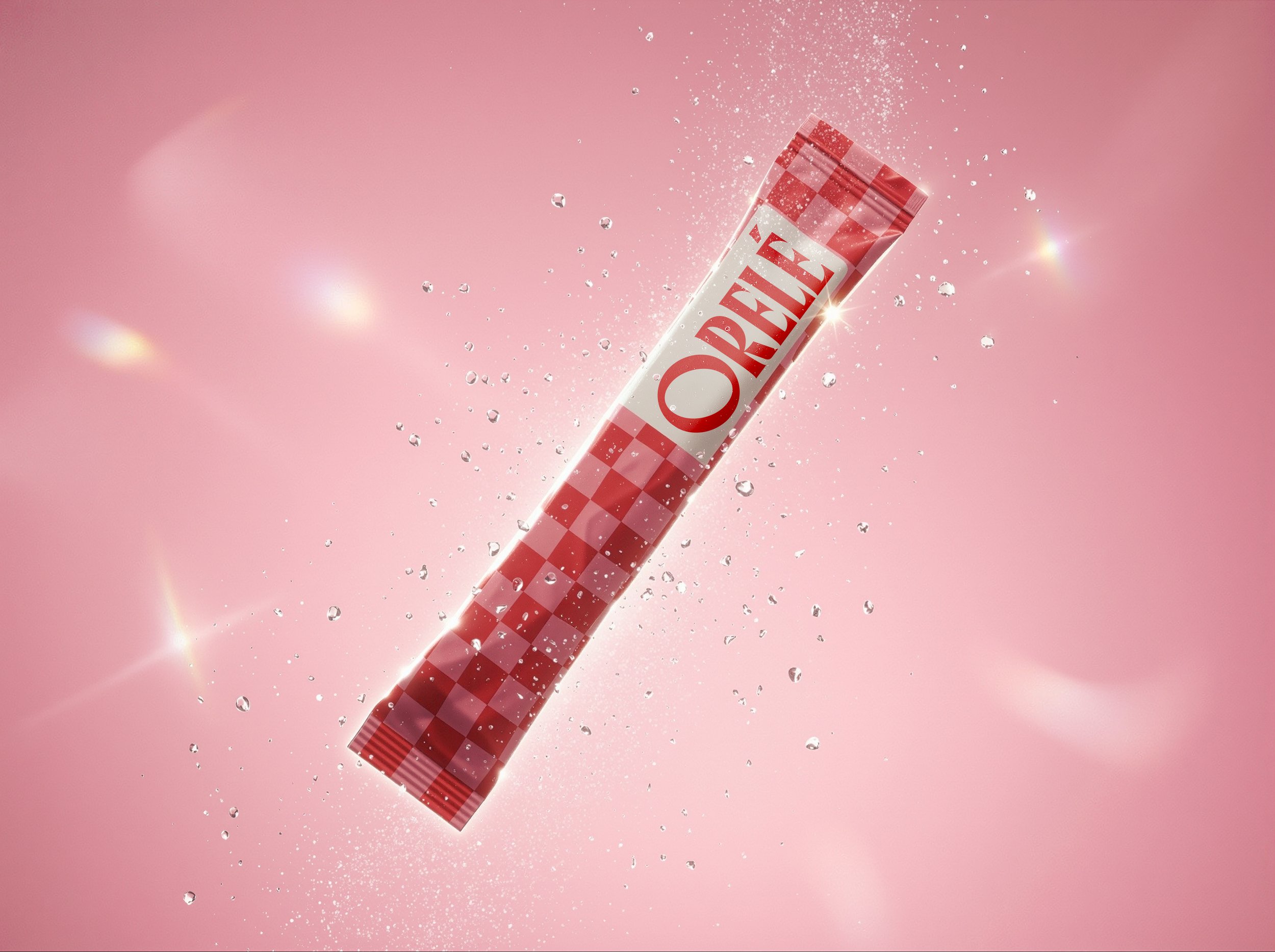
PACKAGING