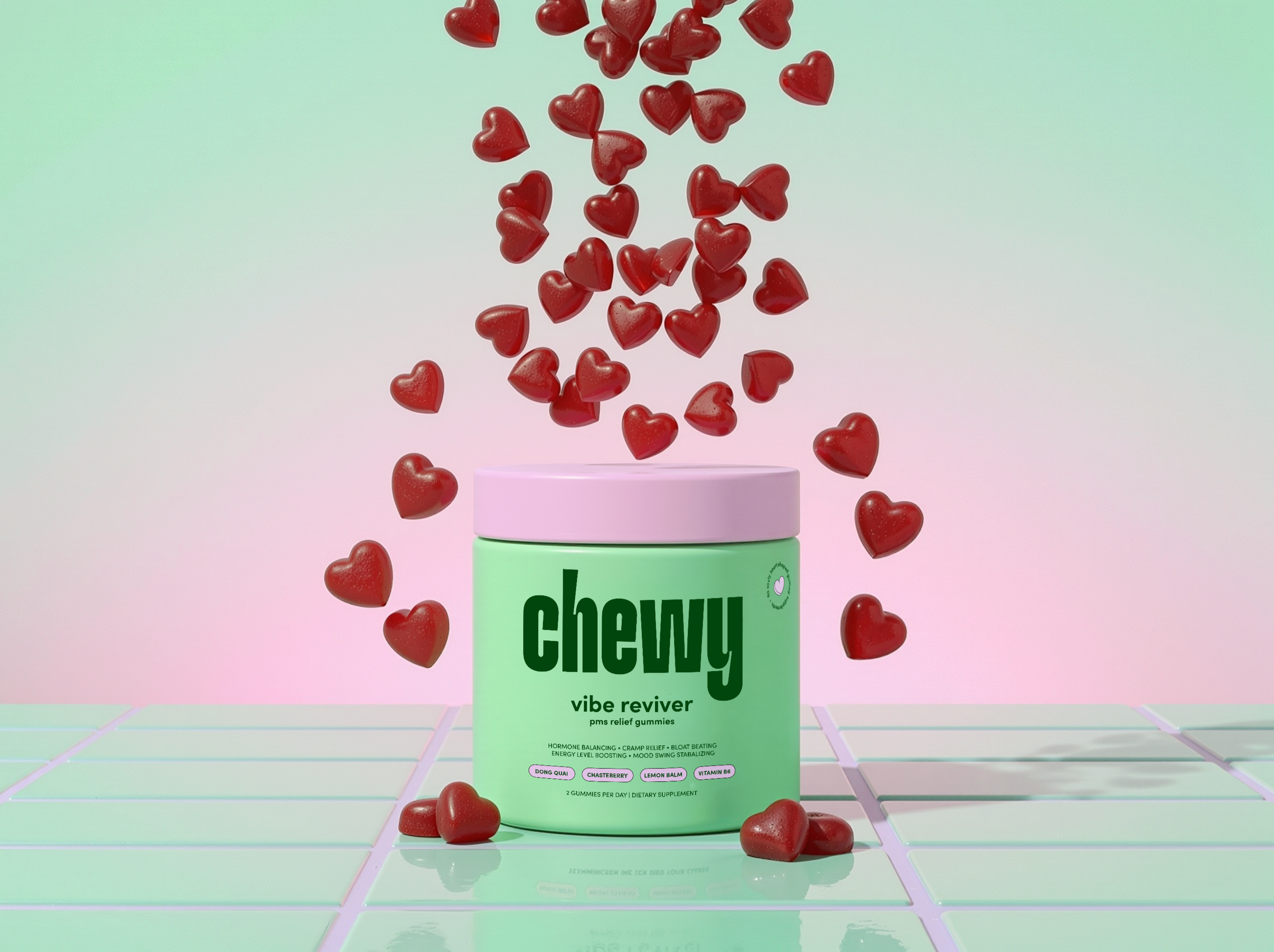
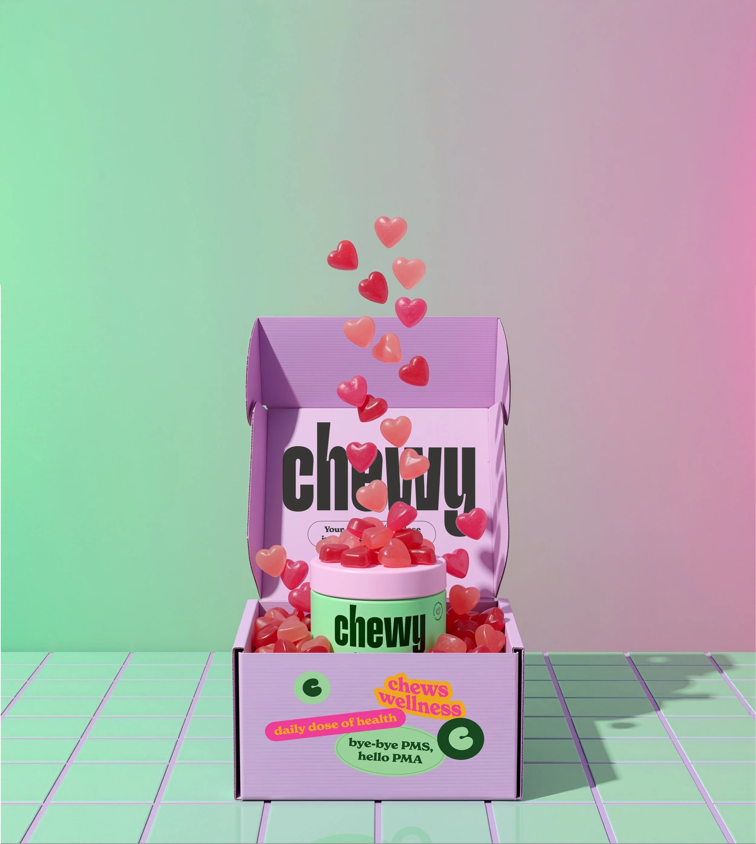
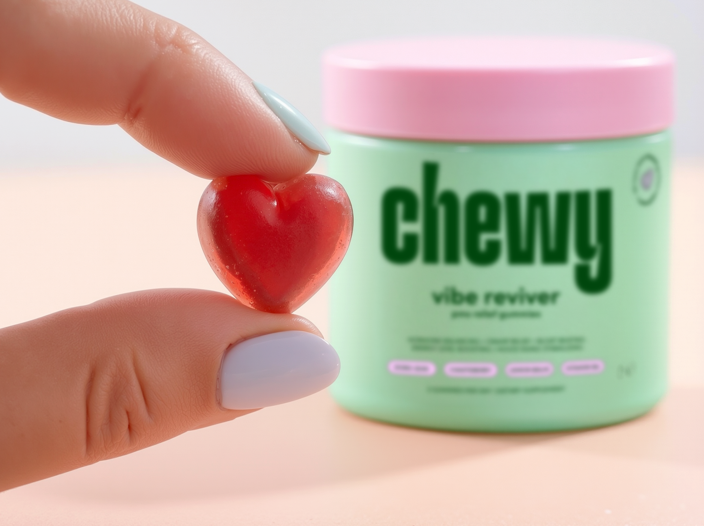
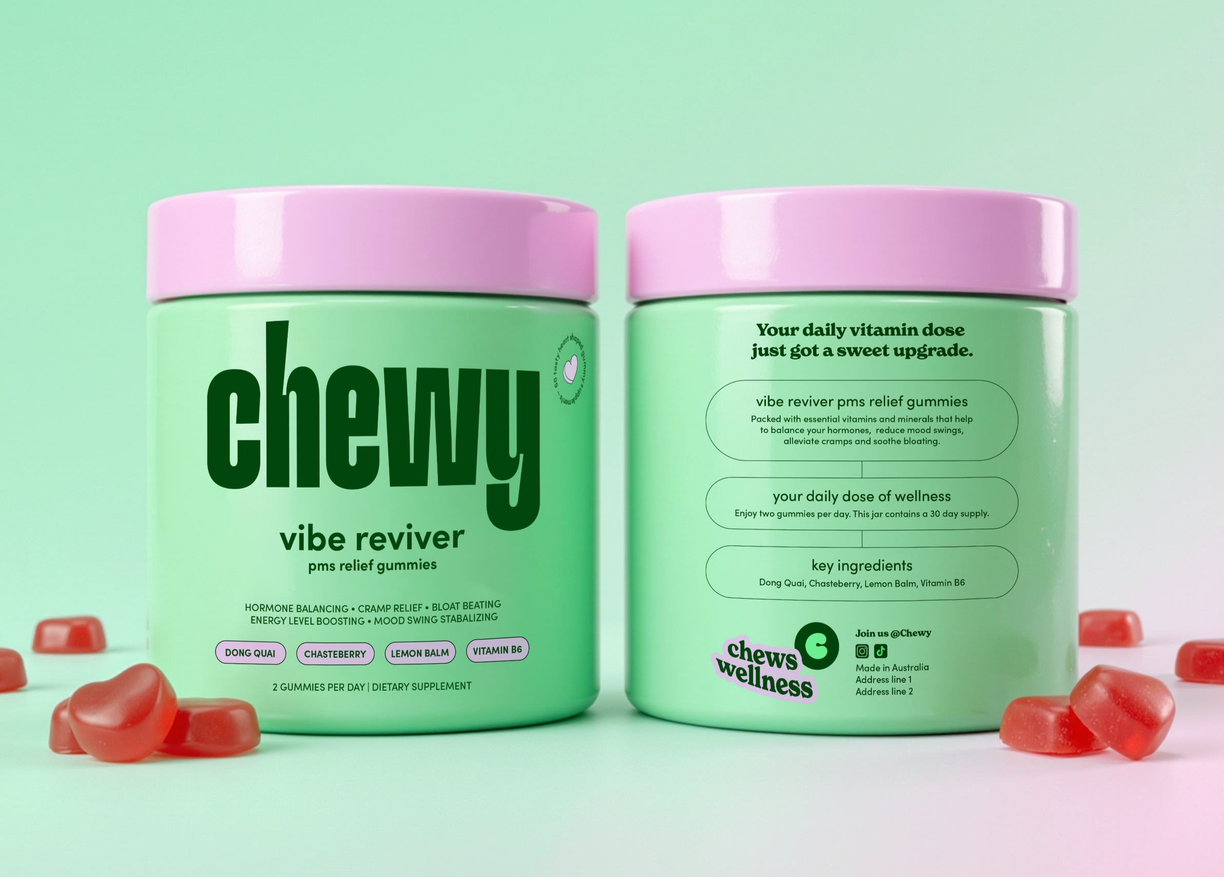
Chewy is an Australian daily vitamin brand designed to make supplements feel simpler, more approachable and genuinely enjoyable to take. Launching with Vibe Reviver, a PMS relief gummy, the brand focuses on turning functional health into something easy to understand and easy to integrate into everyday routines.
BRANDING
PACKAGING
The Challenge
Much of the supplement category in Australia leans heavily into clinical, medical aesthetics, with minimal logos, white packaging and sterile typography. While this approach communicates trust, it can also make brands feel impersonal and difficult to differentiate. Chewy needed a visual identity that could clearly communicate important product information while bringing a sense of personality, energy and recognisability to the space.
Our Solution
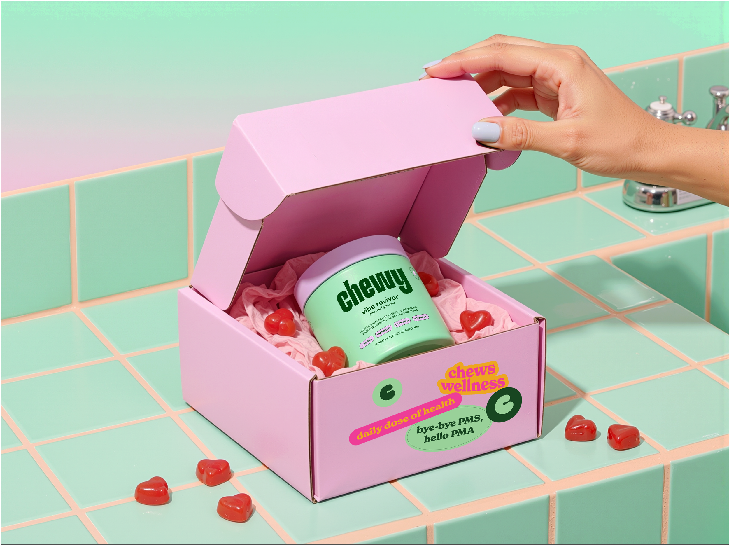
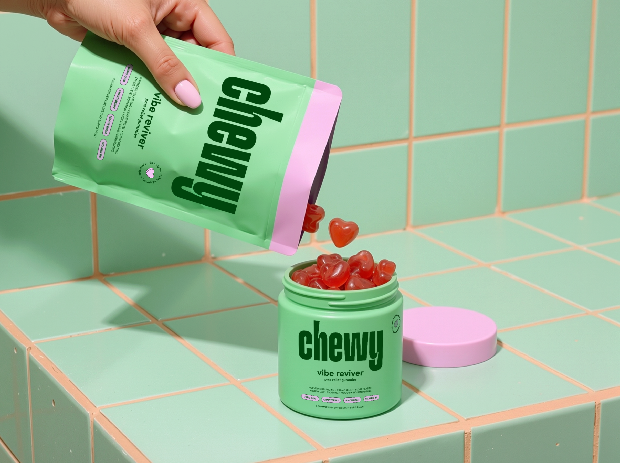
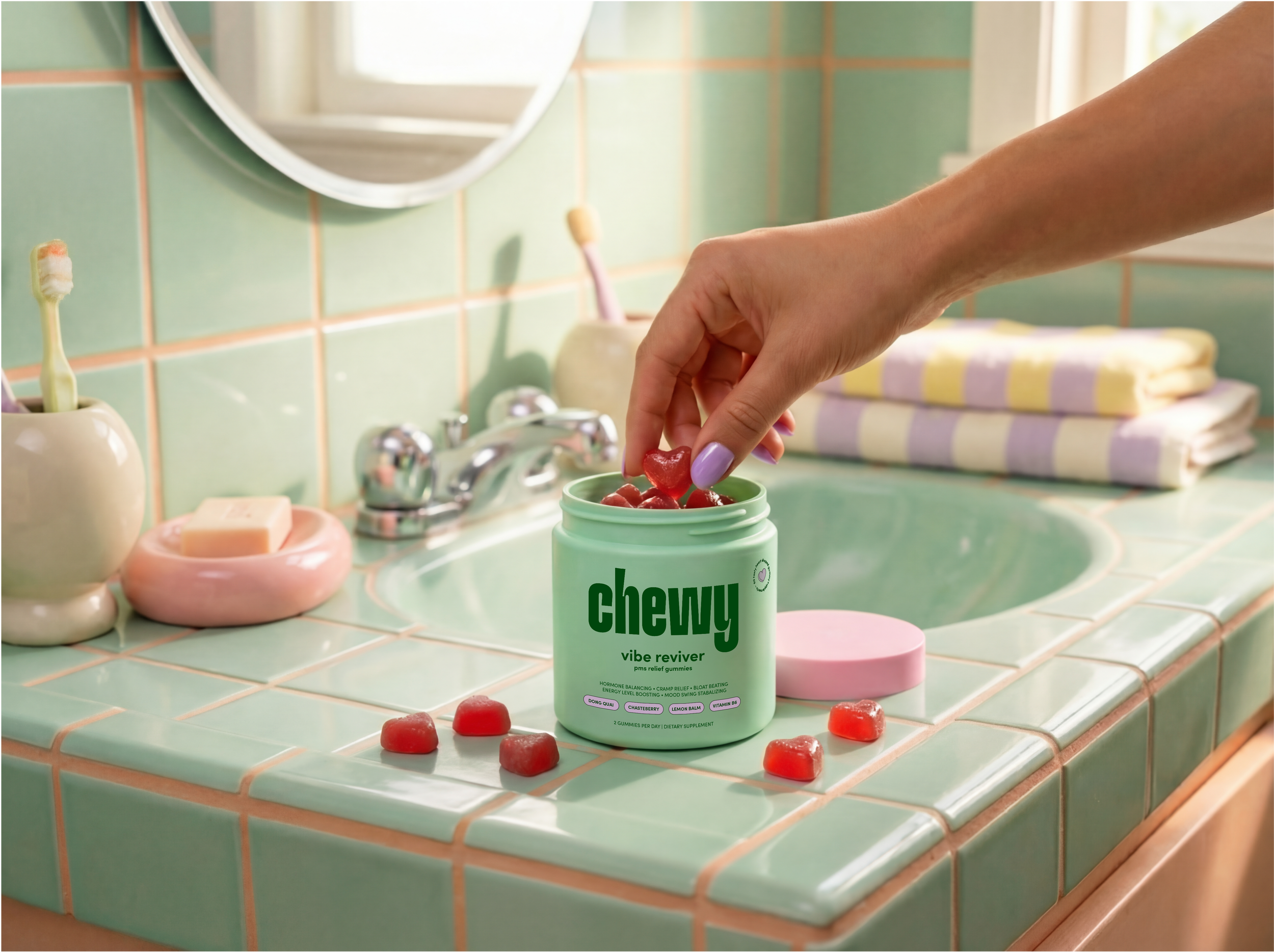
We developed a bold, typography-led identity designed to give Chewy an instantly recognisable presence within the category. A distinctive logo with playful, ownable type sits at the centre of the brand, supported by a vibrant colour palette that brings energy and personality to the packaging. This expressive visual system is balanced with clean layouts and clear information design, ensuring the products remain easy to understand while standing out from the clinical aesthetic of traditional supplement brands.